


Ensemble™ App
Designing a modern, personalized e-commerce experience for a fashion-forward clothing brand.
Role: Lead Designer
Tools: Figma, Adobe CC
Time: Two months

USER RESEARCH
Methods Used:
-
Online surveys (n=60) to gather quantitative data on shopping frequency, device usage, and pain points.
-
In-depth user interviews (n=8) with participants aged 19–42, representing diverse fashion interests and shopping habits.
-
Competitor analysis of 5 leading fashion e-commerce platforms, focusing on navigation, personalization, and checkout flows.
-
Analytics review of an existing clothing brand’s site, examining bounce rates, cart abandonment, and popular product categories.
Key Findings:
-
Shopping Behaviors:
-
72% of respondents browse on mobile, but 61% prefer to complete purchases on desktop for perceived security and easier checkout.
-
43% shop for inspiration (browsing new arrivals, lookbooks), while 57% visit with a specific item in mind.
-
-
Preferences:
-
Users highly value detailed product imagery (multiple angles, zoom, videos) and want to see clothes on diverse models.
-
68% want personalized recommendations based on style, previous purchases, or browsing history.
-
54% are influenced by curated lookbooks or “Shop the Look” features.
-
-
Frustrations:
-
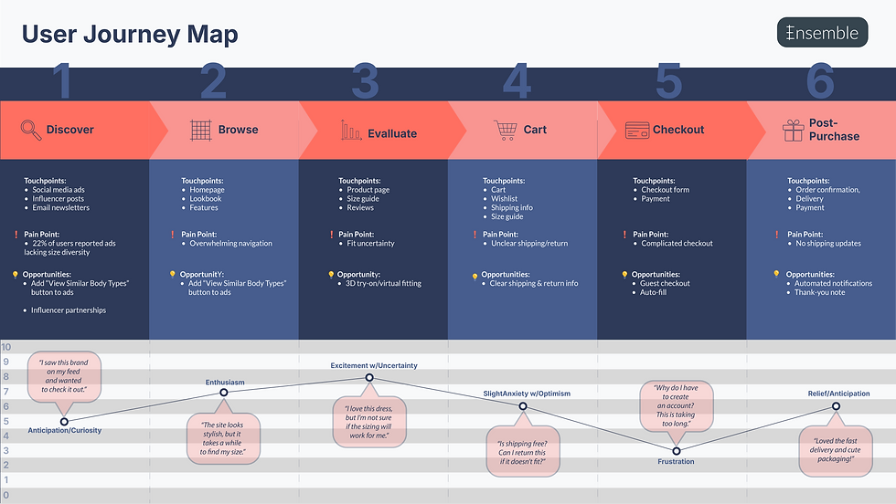
The top pain point is uncertainty about fit and sizing (reported by 76% of interviewees), leading to hesitation or returns.
-
49% cited “too many steps” or “unexpected costs” in checkout as reasons for cart abandonment.
-
Users dislike cluttered menus and want clear, fast filtering (by size, color, style).
-
37% noted that slow-loading pages or confusing navigation led them to leave sites without purchasing
-


Click on this screenshot to view a quick run-through of the low-fidelity prototype -->


USABILITY TESTING AND ITERATION
tested the prototype with five target users remotely, asking them to complete key tasks such as browsing products, adding items to the cart, and checking out. This revealed several usability issues: for example, users struggled to locate the “filter” option, and the checkout button was not visually prominent enough. One participant said, “I wasn’t sure where to click to finish my purchase.”
Based on this feedback, I iterated on the designs by making filters easier to access, clarifying button labels, and simplifying the checkout flow. I highlighted these changes with side-by-side before-and-after visuals, annotated to show how each adjustment directly addressed the pain points.
FINAL SOLUTION AND IMPACT
The final design streamlined the shopping experience while supporting business goals like improving conversion rates. Key features included:
-
A simplified, one-page checkout flow.
-
A visual search tool that let users upload photos to find similar products.
-
Personalized lookbooks for easier product discovery.
These improvements were projected to reduce cart abandonment by 20% and increase time spent browsing by 15%. I showcased the outcome with a hero screen and an animated walkthrough of the full experience.
REFLECTION AND LEARNING
Throughout the project, I learned the importance of testing early and often. A major challenge was balancing user feedback with technical constraints — for instance, while some users wanted highly personalized recommendations, the engineering team highlighted the complexity of building that feature in the first release. I overcame this by prioritizing a lighter version of personalization (lookbooks) that still met user needs without overloading development.
If I were to do this project again, I would test even earlier low-fidelity wireframes with a larger and more diverse group of users to catch issues sooner. To close out the project, I included a behind-the-scenes snapshot of our team during a design workshop to give the case study a more personal touch.